What I worked on:
Brand identity design
Brand rollout
Packaging
Website design & build
What I worked on:
Brand identity design
Brand rollout
Packaging
Website design & build
Faber & Lo
In 2015, along with my close friend Mary Faber, I founded a design studio. Our vision was to help businesses elevate their brand. Though Mary and I have very different design styles we wanted to keep our brand clean and simple, and to act as a platform (rather than a focal point) to showcase our work.
Brand
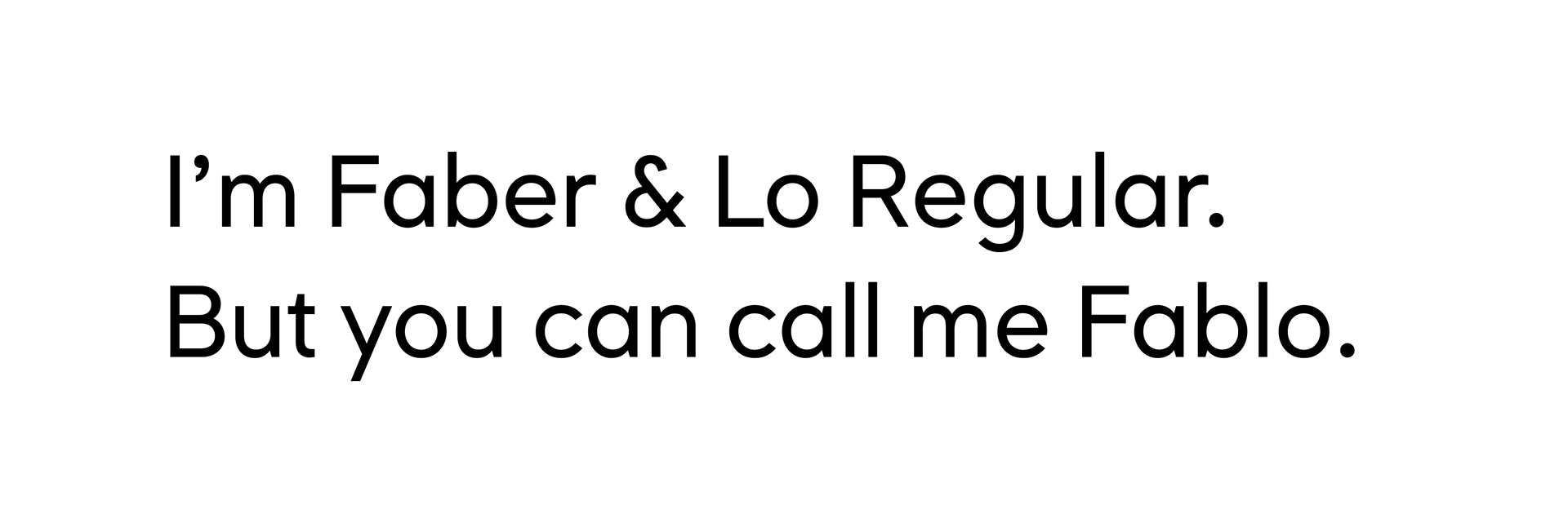
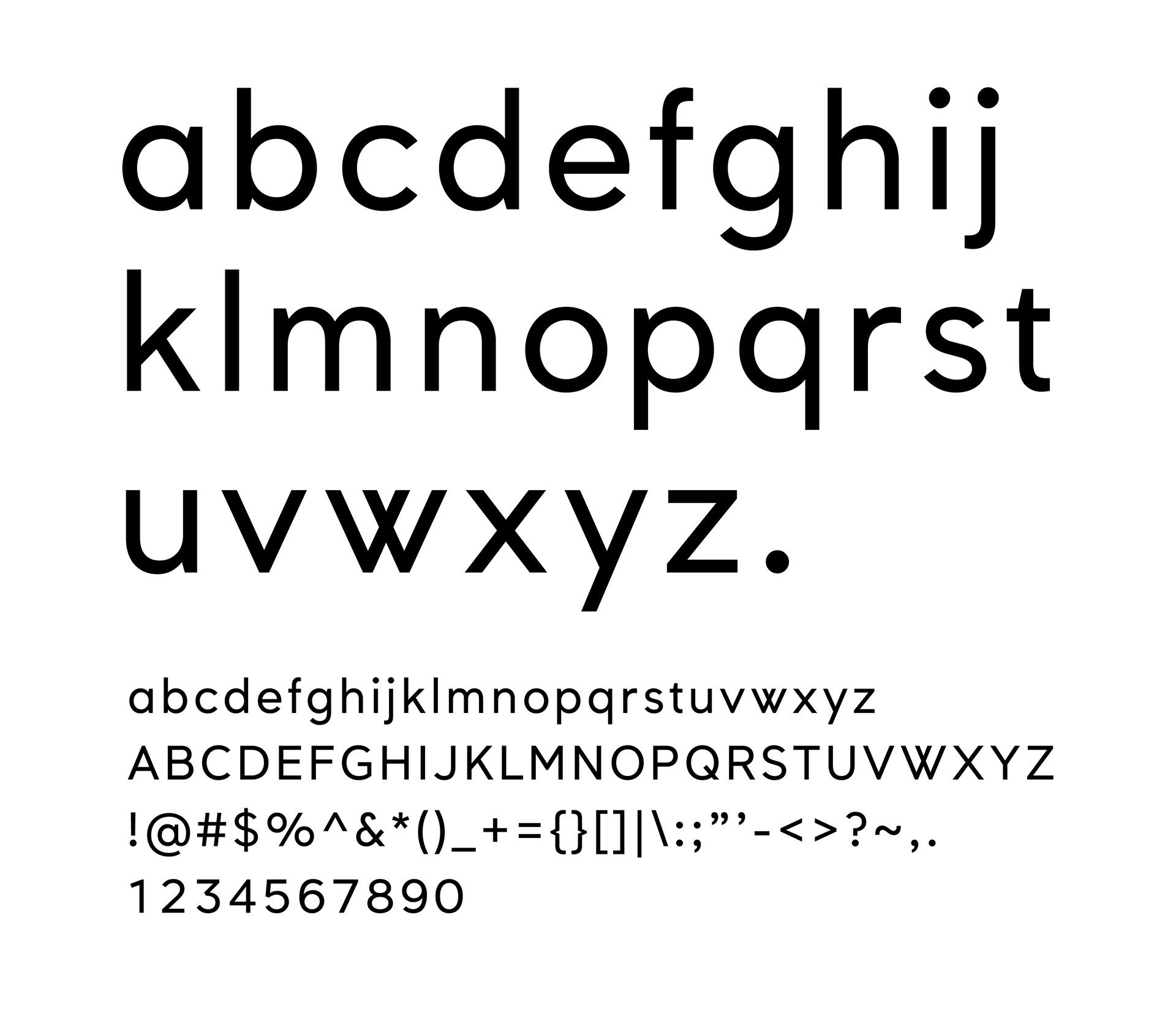
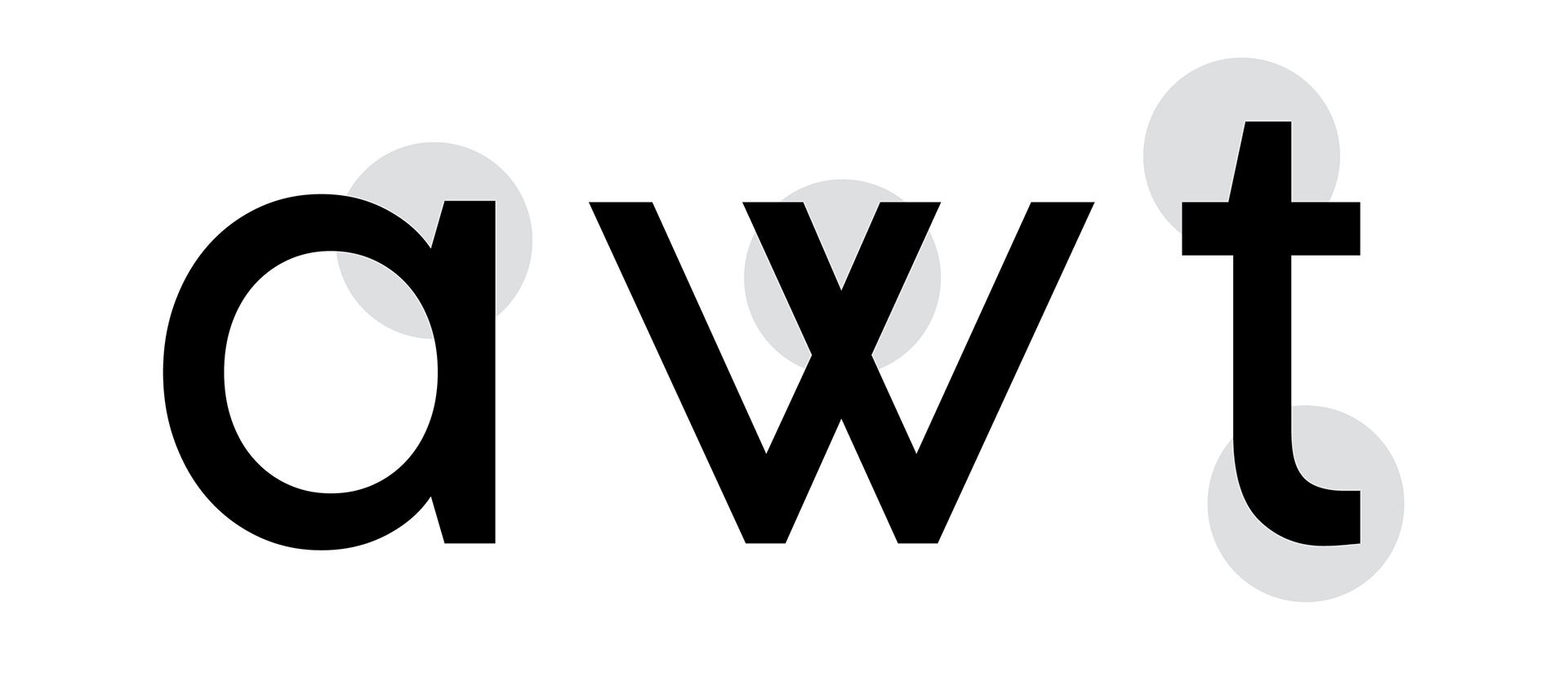
Our branding for our new design studio needed to be modern, fresh, and to project connotations of professionalism and trustworthiness. With the new studio having a strong typographic focus, the custom type logo design was developed with a strong geometric sans-serif grounding. This was combined with unique angular terminals and a distinctive ampersand that combines two overlapping sections to represent the coming together of ‘Faber’ & ‘Lo’. This Faber & Lo typeface expanded upon the logo design features, with the unique angles on short terminal ends, and with a particularly distinctive ‘W’ & ‘w’, representative of the coming together of two, as also reflected in the ampersand.
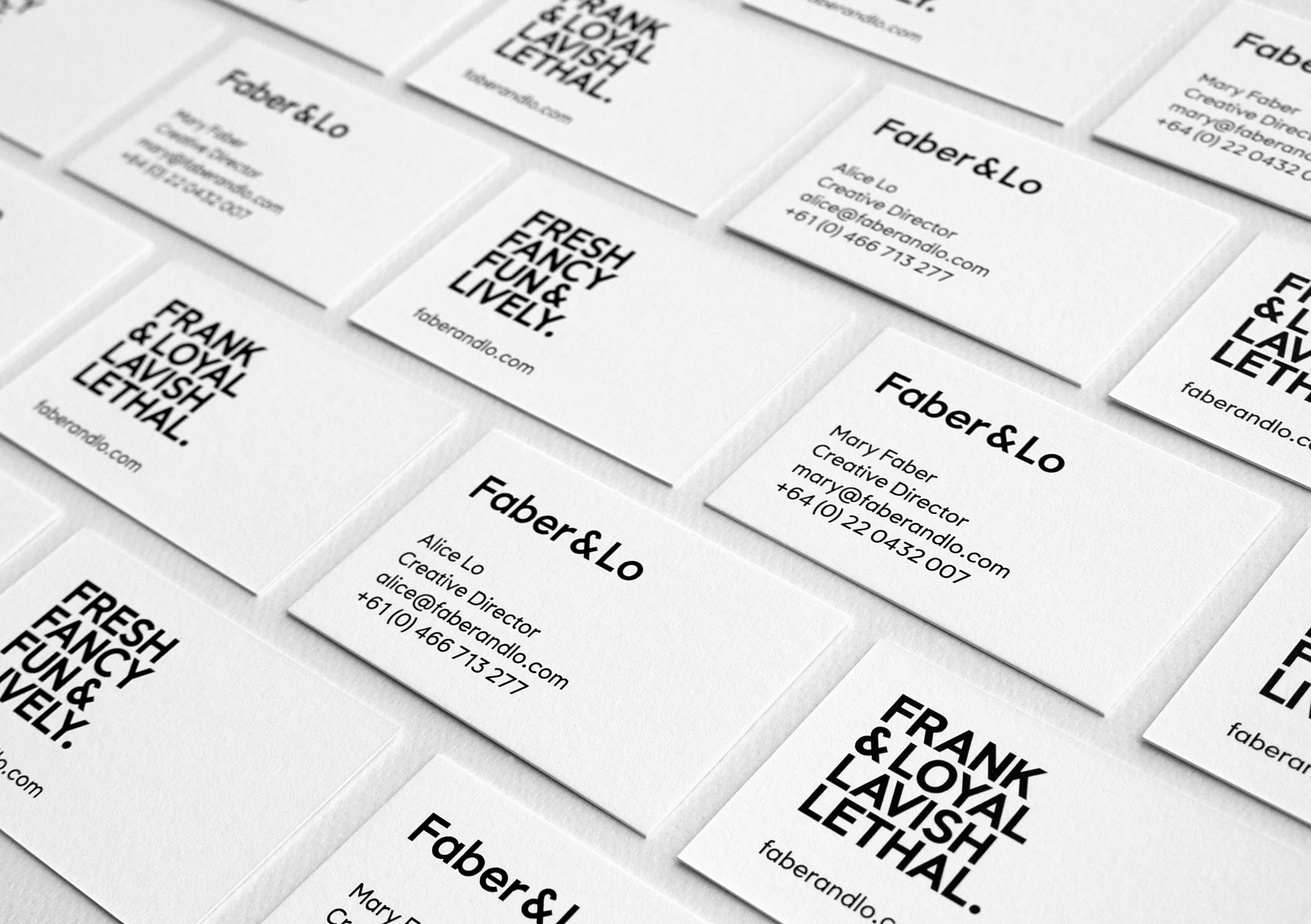
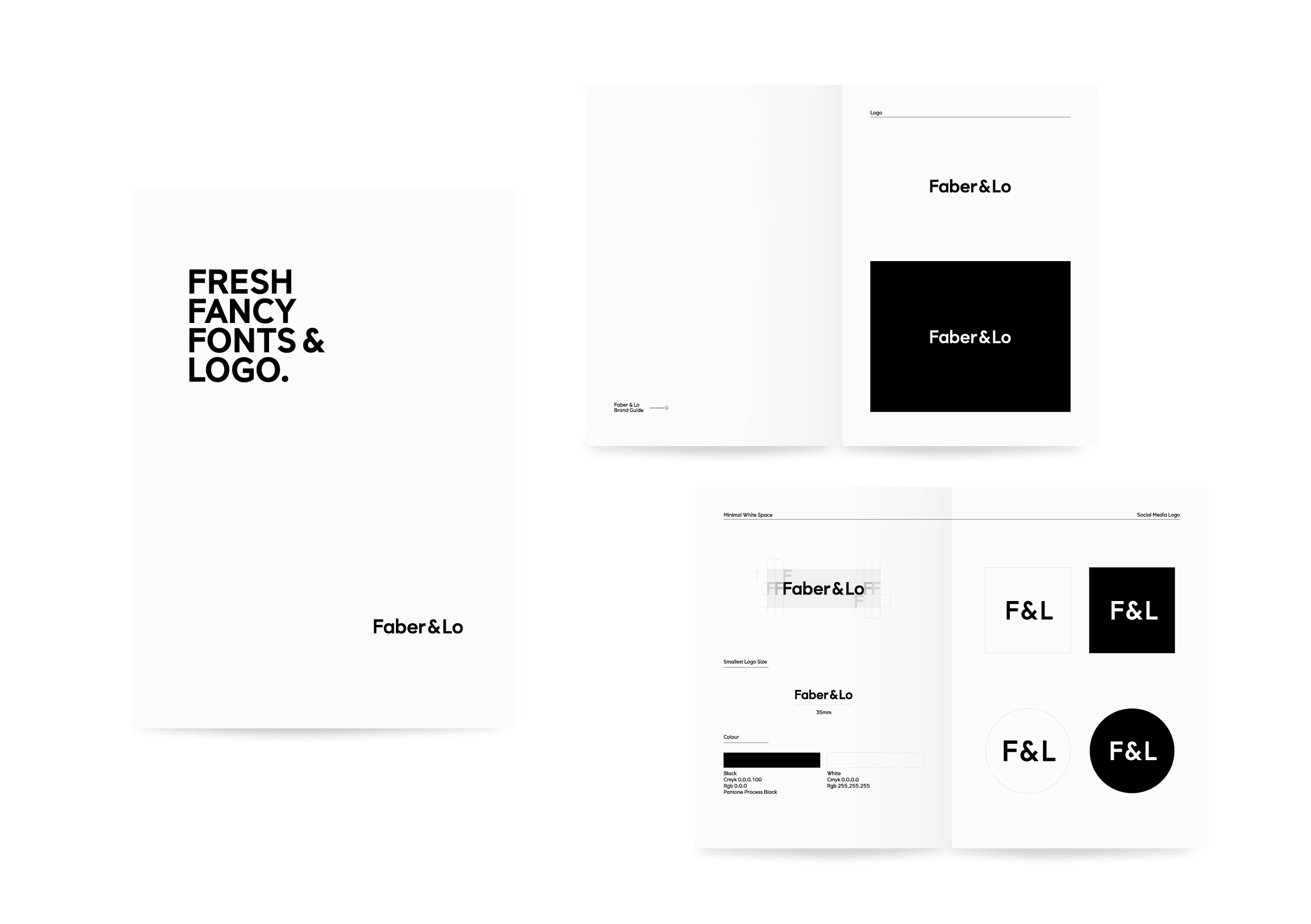
Business Cards & Brand Guide
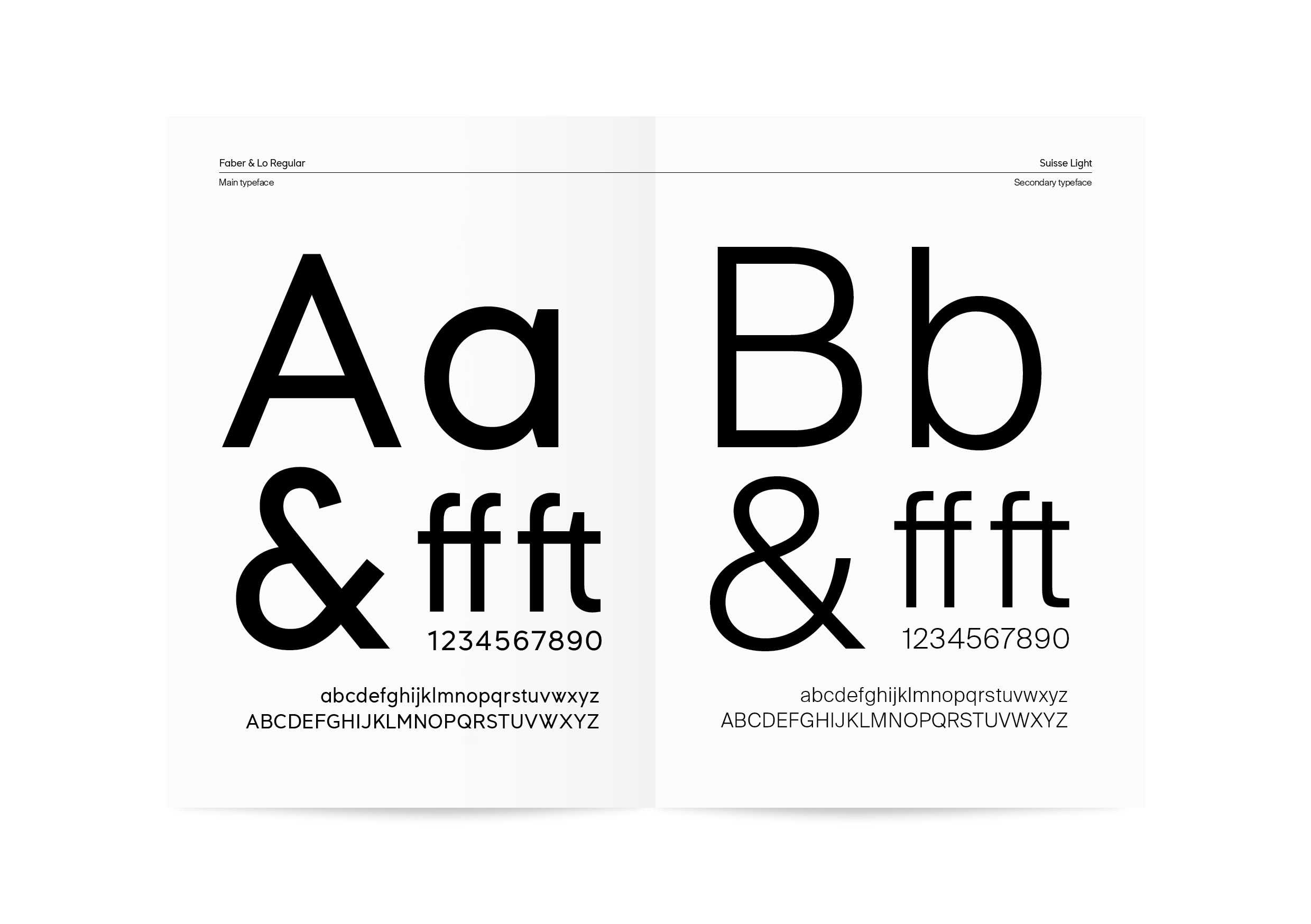
Typeface Design
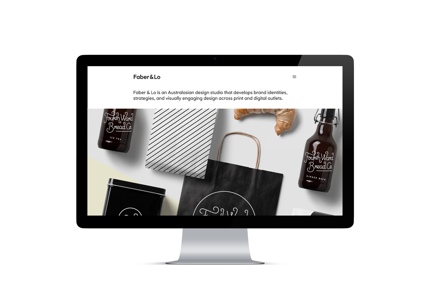
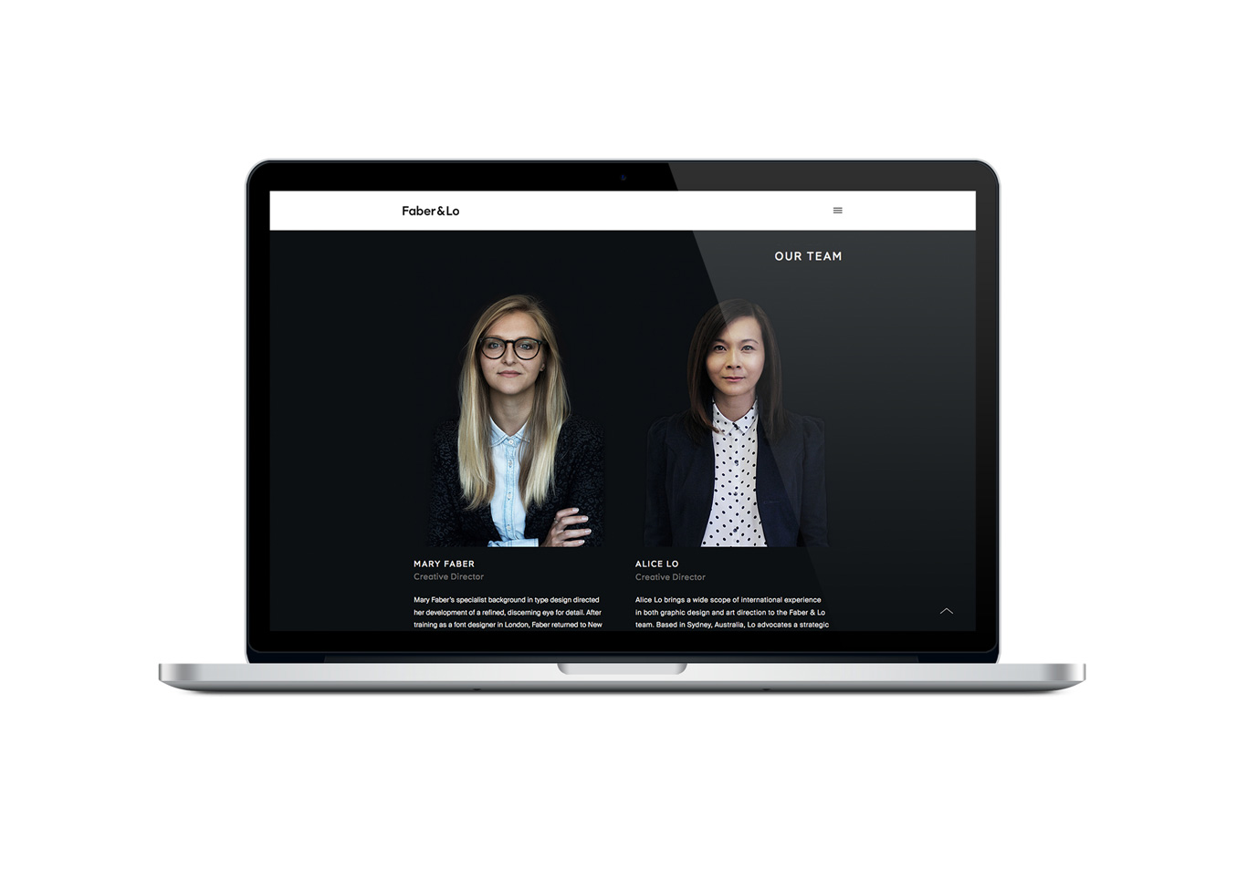
Website Build & Design
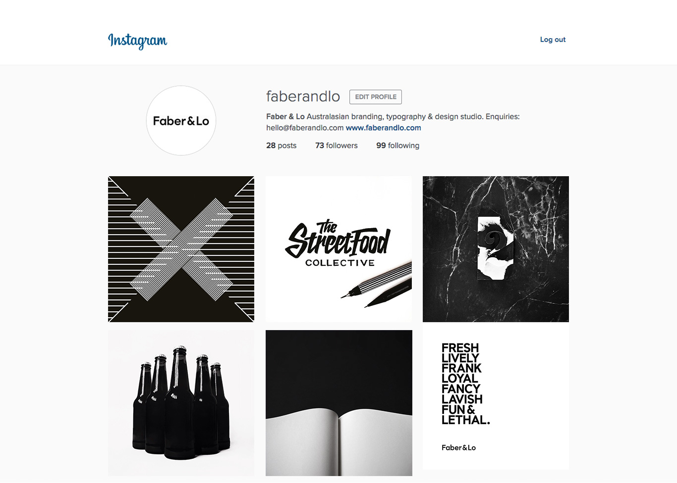
The result of this project was a fresh new brand that combined a minimalist approach with unique but subtle idiosyncrasies. The clean and bold aesthetics are functional and also provide a transparent platform for showcased projects to speak on our website and social media.
Wine Label
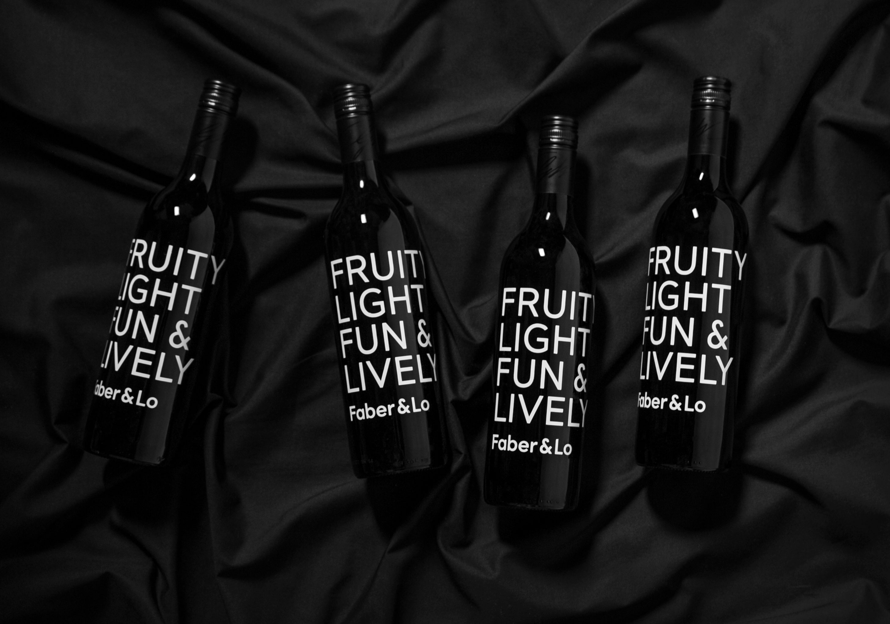
We designed and made our own wine labels to gift to our clients for Christmas.
Team
Team
Designers: Alice Lo & Mary Faber
Font design: Mary Faber
Art direction: Alice Lo
Photography: Alice Lo and Tina G Lee
Image editing and retouching: Mary Faber
Designers:
Alice Lo & Mary Faber
Font design:
Mary Faber
Art direction:
Alice Lo
Photography:
Tina G Lee
Image editing and retouching:
Mary Faber
Say Hello
Say Hello
© Copyright Alice Lo